


Happy New Year! 2025 has arrived and with it, is another cute animal drawing by yours truly, and also – an art show!
First and foremost, please welcome, our latest arrival, gazing out the window (doubtless at birds he’d like to eat!) with great focus and aplomb, TOEny:
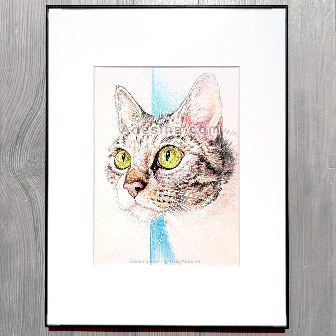
TOEny is the furbaby of Paula, a mutual friend on Instagram, and apparently, he’s a polydactyl cat, hence the spelling of his name — but he’s more than just his toes, and as you see from my portrait, drawn from a beautiful photo his mama took of him, he has FANTASTIC green eyes. To highlight them, I added metallic glitter pen that sparkles when you look at the piece from different angles! And, because white whiskers on dark fur can be a challenge, this drawing is actually a PAINTING, because I painted the whiskers in white acrylic paint, giving them a 3D effect!
I drew many cute animals in 2024, some of which I’ve posted to this site, however this is probably the culmination of all the 2024 cute animal drawings I’ve done. And almost as if to celebrate, I’m happy to announce that I’ve been invited to show three of my drawings in a group art show in Westchester!
Details:
PodArt Gallery - January Show!
@ ThePod by CocoaCompassion
Westchester, NY
Artists:
ADESINA & Isabel Grossman
Opening: Saturday, January 4, 2025 6-7pm
Free and Open to the Public!
UPDATE: ALL 3 PIECES ARE SOLD! I sold out! Thank you to Suzanne for purchasing and giving my little animals new homes! 🙂
All art will be for sale and available to purchase the day of the opening, and for as long as they last for the month of January. 20% of the proceeds will go to benefit mental health & wellness programming, which is very appropriate because these drawings (as well as the other art in the show) were all done in the name of mental health. 2024 was a challenge, and truly, drawing these sweet little animals was such a welcome break from more “serious” work, and really helped me jumpstart my mental health practice of making art not just to impact the world, but also…just because it makes me happy! (And ironically, by selling these pieces to benefit mental health initiatives, they are still impacting the world — so win-win!)
Drawings I will be showing:
“TOEny: Cat in the Casement”
“Hallucenogenic Hare”
“Road Trip? Alpaca Lunch!”
Please come down to the POD on Saturday if you are in Westchester or the metro NYC area; I would love to see you!
In the meantime, Happy 2025 and stay tuned for more art, more fun, and more community!
xoxo,
ADESiNA

It doesn’t matter if you’re a creative professional who likes working on your own schedule, or a nine to fiver managing highly confidential client accounts; burnouts are a thing! When it comes to artists and creative folk in particular, burnout is sometimes related to a lack of inspiration.
Personally I’ve felt burned out on numerous occasions in my career and have found that there are things we can do to re-inspire ourselves and get those creative juices flowing again. I’m going to share some of those with you here over the course of this blog. Bonus: This is really two blog posts in one, because at the end, I’ll share one final way to stay creative (making prints), that will add a new facet to your art business in the process!
Inspiration for an artist is where all the beautiful and captivating work springs from. Without it, creating becomes a lot harder, if near impossible. How does one overcome the feeling of burnout and proceed to re-inspire? Here are some tips that can help.
At times, amidst a burnout, you might have a fleeting idea when you least expect it. At these times you would probably wish you had your art supplies or tools close by. Well, why can’t you? Keep your basic supplies close at hand. Even when on the go, carry a sketchbook or moleskin. This way, you can catch that fleeting inspiration when it comes and build on it later!
As many artists would know, there are times when a process has you studio-bound for days, if not weeks on end. This is all well and good, however if the walls of your studio start closing in and your feel inspirationally dry ? Get out! Immerse yourself in some spontaneous activity. Hit the city center, go get yourself some ice cream, talk to a stranger. Basically, live a little. Life is full of inspiration and there is no telling where it might come from!
 Artist sitting on the floor with their brushes
At times as artists, we get a little caught up in our technique and pursuing perfection. The trouble with this, is that at times we can become self critical to the point of stagnation. If this is the case with you, and you find yourself shooting down your own work before you even begin, lighten up. Take out your paints or whatever medium you use, and make a mess — on purpose! Have at it. Get the clutter out, and the good ideas will surely flow!
If you’re feeling a little tired of the medium you’re working with, shake things up a bit! Try out another medium or even another art form entirely. Your mind is vast and there will likely be more ways than one to re-spark your creativity. I like to rotate entirely different mediums on a regular basis: ceramic sculpture on day, oil painting the next, and then a quick pencil sketch on the weekend — like this one below, that I drew recently!
 Artist Adesina sketches a young woman with sea green eyes.
Observing and taking in other works of art is actually quite inspiring. You might have heard of artistic responses. An artistic response is work done by one artists inspired by the work of another. If you feel you’re running short on inspiration, visit some of the local galleries or connect with other artists to view their work.
You can even look for original artwork for sale, (or prints if you’re on a budget), that you can put up in your own studio, and surround yourself with art to inspire and uplift you! My skull framed art prints (see below) are among my most popular pieces with my fellow artists. And if you’re local, there’s always a lot of brilliant artwork for sale in NY that you could check out and possibly use to re-inspire yourself. I recommend hitting up the galleries down in Chelsea, and once you’ve found something you like, you can wrap up your afternoon with a stroll down the Highline — a perfect close to an inspiring day!

Skull, Poster-size original skull art by Artist Adesina | Buy a Print
Still can’t find that spark of inspiration to create something new? Well, why not re-invent something old? Creating prints out of your favorite pieces of art is a great way to stay productive & creative, without the pressure of having to make new work. And if you plan to eventually license your work for products, a lot of the steps you must undertake to make prints, will help you with that as well.
First, depending on the size & shape of the piece & the size of the prints you want, you’ll have to decide if you want to scan or photograph your work.
Very large pieces, and pieces that have 3D elements, might work out better with photography. Make sure you have good (sunlight or artificial light that is daylight temperature), even lighting, and that there is no glare on your artwork if it’s shiny. When I was creating my skull framed art prints, for example (see below), the graphite was super shiny on camera, and although that was ok for displaying the original piece on my web site, I knew that it would be terrible for prints. So I had to re-take the photo, using indirect lighting that came from several angles: diffuse lighting from a set of large windows in front, and three daylight-temperature photography lights positioned around the room, which I pointed away from the drawing, and bounced off the ceiling and walls. It was quite a setup, but it was really worth it, and saved me so much time later in Photoshop.

Moodily lit photo of Adesina’s original Skull drawing 🙂 — Too much shine for prints!
For photos, also make sure that you are using a good, high-resolution camera; a DSLR is great. Plus, be sure that you are using a lens that minimizes distortion. I personally have an 85mm lens that works well for just about all my medium to large works. I also recommend a tripod, so that your shots are crisp and clear.
For smaller pieces, you should scan them in with a high-resolution scanner (600 dpi or more) that is equipped to handle details. Epson and Canon make excellent scanners that last a long time and have great color fidelity. Alternatively, you can take your work to be scanned commercially, but be prepared to pay for quality. I find that in the long run, it makes more sense to invest in a good quality scanner, than to constantly have to outsource your scanning.
Whether you scan or photograph your work, you should still adjust the images afterward in Photoshop. If you don’t have Photoshop, there are a few other programs that might work, however Adobe PS really is the industry standard and makes this work infinitely easier. I believe a subscription is under $10/month at present for the program, although you should double-check before signing up.
Put your artwork in front of you, and compare it to the image on your computer. Do they match up? For photos, pay special attention to the proportions of the image: are the edges straight? Is the image stretched horizontally or vertically, or are the proportions correct? Use guidelines to help you line things up, and turn on rulers so you can measure. For scans, you may have had to assemble multiple scans into one image using Auto Blend; if so, did the merged result come out correctly, or are there tweaks that you need to make where the layers come together?
Next, look at color. Again, make sure you are looking at your original art in good, even, daylight-temperature lighting, and compare it to what you see on the screen. Do the colors match? Instead of editing the actual pixels, use Adjustment Layers like Hue/Saturation, and Curves, to alter the colors of your work. This way you don’t damage any pixels and can easily reverse any changes you don’t like. Also utilize masks and channels if there are only certain parts, or certain colors, that you want to change. Again, this is preferable over chopping up the actual pixel layers, because a mask is easily removed, and also results in a smaller file when you save the PSD.
Finally, you may need to sharpen your image before printing. Again, you must use your artist’s eye to determine if this step is necessary, but if it is, I recommend using the Smart Sharpen filter; and, if the image is not too big, I also like converting a flattened layer of the finished image into a Smart Layer first and THEN applying the filter. This last step enables you to continue to adjust or remove the filter after applying it.
After you are satisfied with how your digital copy looks, you will have to export a flat copy to print. What format you want to use, depends on what service you will print with. If you are doing professional, limited edition giclee prints, I recommend being in direct contact with the print shop and even sending them the PSD file, to make sure they have exactly what they need. For print on demand services like Zazzle or Fine Art America, check their guidelines on their web site, to see what size and format they need.
Some popular formats for art prints are: Jpeg, Tiff, PDF, EPS.
In the past, print files were usually CMYK, but nowadays, some print services are requesting RGB images, that are normally only reserved for on-screen use. Again, check with the print service you are using, for their requirements.
If you have a good printer at home and are printing yourself, then you might want to experiment to see what gives you the best results. First, check your printer’s instructions to see any recommendations the manufacturer may have regarding art prints, and the type of paper you are using. Secondary to that, in my experience 8 bit Tiff files, at 300 dpi, CMYK, have looked best on my own personal printers.
Once you have exported a flattened version of your image, you’re all set to go! Print it out, or send it to your print service. And of course, don’t forget to update your web site with your new offering! Congrats, you now sell prints :).
There are many other ways for you to get re-inspired. It’s really about getting out there and figuring out what works for you best! As an artist; true inspiration is really within you, it’s just a matter of finding out what helps you connect with it.
Found this article helpful? Then share it using the sharing tools below. Or leave a comment and let me know what tips you are going to use to get your creative juices flowing, or if you have any questions. I love to help my fellow artists succeed!
Be well,
Adesina <3

Happy MerMay!
So I started this drawing last MerMay, and even though I signed it, I never really felt I had finished it. So since May has swung around again, I thought I’d take it out and add some more color!
Here is last year’s post — Hit the right arrow to see the original progress video 🙂
And here’s an update from today! Check out the deep blues and greens of the water – What do you think? Should I add some coral to the sea floor?
I hope you guys like the picture so far, and stay tuned for a finished version!
Love,
Adesina

Above drawing: Cartoon Portrait of Star Ruiz by Adesina, 4.5″ x 6.5″. Copic Markers (all colored areas), Sharpie (large black areas), Sumiiro brush pen (black lines), white gel pen (white highlights), & watercolor (gray in eyes & teeth), on heavy weight drawing paper.
So I’ve been meaning to try out Copic Markers for the longest, and I bought a couple packs a few weeks ago, but I didn’t have a chance to open them up until now.

Copic Sketch marker sets – aren’t they beautiful? 😀
Well was I in for a treat! These markers are so much fun to use; nothing like the regular markers we all played with as kids. First, they blend really well – if you color in an area all at once, you get almost no streaking, and if you layer a light color right next to a dark color that is still somewhat wet, you can blend the edges together to create an almost watercolor effect.
In fact, that’s what I would compare them the most to: watercolors. Like watercolor, they also bleed through regular paper. I used pretty heavy drawing paper for my drawing, but the next page in my sketchbook still had lots of bleed through on it, so next time I will put a piece of scrap paper in between. Also, I noticed that any area you color bleeds a bit into the adjacent areas, especially if you are heavy handed, so in future I will not color right to the edge of my lines, but instead I will stop maybe a millimeter away, and let the bleed carry the color to the edge.
 Also, I discovered a few things about the colorless blender. I thought it was something I could use similar to the way you use the colorless blender pencil with Prismacolors: layer two colors one on top of the other, or side by side, and then rub the blender on top to make them one solid hue, or to create a seamless transition. Nope. The markers themselves actually naturally blend on their own. Layer colors one on top of the other and they will create a new color (and not always the color you anticipate either, so test it on scrap first lol), and as I said before, if you use one color right next to another that is still wet, they will also bleed into each other naturally.
The colorless blender is actually more like an eraser of sorts. You can use it the same way you would use a clean brush dipped in water, with watercolor. It can lighten colors, and I was even able to use it in order to clean up some edges where the markers bled excessively. But if you are too heavy handed it can also cause the paper to warp, and colors to bleed even more, so be careful.
Timelapse of my drawing:
And, similar to acrylic paints, these markers dry lighter than they go on. Which made it a bit confusing when I was trying to touch up some of the shading on areas that were already dry — it was hard to tell if I was actually making the area darker, or if it just looked darker because it was wet compared to the dry areas. I think in future I will try to only work wet into wet when I am shading, or at the very least, make a mental note of what colors I used where, so that I can either match the color, or pick the right darker color to shade it with.
And finally, I definitely understand now why people buy so many different colors. Although they do blend, the colors they create are not always intuitive and some unexpected results can happen. If you really want a specific color, you need to buy it, because chances are, you won’t be able to mix it perfectly with just the primaries. So I think I’ll invest in a few shades of gray, as well as some secondary colors, next :).
If you want to try out these markers for yourself, here are the ones I bought, below (I think the skin tones are sold out until May, but the primaries are avail now):
Copic Sketch Markers – Perfect Primaries
Copic Sketch Markers – Skin Tones
I also bought the colorless blender (Number “0”) and a loose marker, RV25 “Dog Rose Flower” which is a hot pink.
xo,
Adesina

Happy Dr. Martin Luther King Jr Day!
Every year on this day we reflect back on the life and the legacy of Dr. King: his mission to create equality and ease the suffering of those who are unfairly treated, because of their skin color, their gender, or their creed. Today more than ever his message is needed, and even though he is no longer with us, there are organizations that are fulfilling his Dream, one day at a time.
![]()
For almost 100 years, the ACLU has worked to defend and preserve the individual rights and liberties guaranteed by the Constitution and laws of the United States. They have been battling in courts, legislatures, and communities to defend and preserve the Constitution’s promise of equal liberty for everyone in our country: from fighting for free speech, to immigrant’s rights, to fighting against discrimination — in short, they uphold many of the same ideals as Dr. King did, in his lifetime.
If you would like to contribute to their cause, and have a postcard of your own, please find out more here».
In addition, here are two other charities which I urge you to check out; they are contributing to the cause of the Dreamers, and they can use all the help they can get:
Unitedwedream.org/
lc4daca.org/
Thank you so much for reading, and have a blessed day!
xo,
Adesina

This is my first time combining pen and watercolor, and it was such a pleasure! I definitely think I will work on this technique some more and see how far I can push the contrast between the two mediums. And of course, love stylizing the hair – there’s something I really like developing there as well. So glad the buyer likes it – hope you all do too!

I learned a long time ago – when you draw women, you better make them younger & thinner than they really are, or they get upset lol. But this lovely model – her lines and curves were too beautiful to minimize. So when I was done, I showed her and shyly apologized for “exaggerating” some of her features. She smiled at me and said “I don’t see ANY exaggeration.” What a breath of fresh air! Sending you all love & remember, you are perfect as you are!
“Queen of the Sea”, pastel pencils & Nupastel on toned paper, 9″x12″, by Adesina, 2015.


It’s been a whirlwind couple of months, leading up to the gallery show, “I HAVE A DREAM – 50 Yeas of Change,” at El Taller Latino Americano, where I have been invited to display my multimedia tribute piece to honor Dr. Martin Luther King, Jr. It has been the most involved, collaborative, and intense art project I have ever done.
 The gallery opening was on Wednesday, July 24th, and in the weeks preceding I spent over 100 hours creating a painted portrait of Dr. King, based on screenshots from the videos of over 50 people, from all walks of life, who each generously took the time to recite one line from the speech to camera.
In addition, my piece, officially titled “I Have A Dream 2013,” (below, right) includes a video montage of all the submissions I received, and that video can also be seen at the gallery, on a tablet under my painting.

This entire experience has been so moving, and so time-intensive, that I am only now catching my breath enough to step back and appreciate what has been created, not just by me, but by the amazing people who believed in Dr. King’s dream enough, to lend their voices and faces to the project. I am ever in their debt.
The gallery show ends this Saturday, August 10th, so I invite all of you to feel free to come up to 104th and Broadway in NYC and see all of the amazing work before it closes. I am so honored, not only to be able to show alongside such esteemed and established artists such as Felipe Galindo, Martin Kozlowski, & Sylvia Hernandez; but also to be part of an exhibit curated by my wonderfully talented and gifted mentor, artist Andrea Arroyo.
Read Press: El Diario»
If you’d like to visit, gallery hours are Mon-Thurs 10-6, and Sat 10-1, and the address is:
The Grady Alexis Gallery – El Taller Latino Americano
2710 Broadway, 3rd Fl. New York NY 10025. 212-665-9460
It’s free to attend, and I hope you can make it, but either way, more is yet to come for IHaveADream2013.com – so stay tuned! 🙂
xoxo,
Adesina
Just a little over a week ago, I wrapped my yearly children’s art classes at Artistic Dreams International, and I can’t say enough how rewarded and blessed I feel, to see the changes that occur in these kids when their minds are brought into focus, and their eyes are opened up to their true potential.

Last year I taught an all-inclusive, basics-building drawing class that ranged from perspective to observation, from contour-drawing to self-portraiture, and it was fantastic! We packed so much within 3 short hours a day, that I knew each child found at least one lesson that they could really hold onto, and bring into their future art projects.
This year, however, I was informed that may of the children had shown an interest in learning more technically advanced drawing skills. Thus, I was inspired to take things up a notch, incorporate some mixed media, and truly challenge them.
Drawing Exercise: Photos-to-Drawings Picture Grids.
The results, from kids no older than 8 or 9, and some as young as 4 and 5 (not pictured here), speak for themselves:


Now, normally I’d recommend this exercise for kids ages 10 and up, but with help (especially with the grid construction), even much younger children can get something out of it. I took the liberty of making a video of how I created my own Picture Grid: this one I call the “Surrealist Half-Picture,” because much like in Surrealist art, most of the drawing is recognizable and fairly realistic, but I added a few unusual details (which the kids really enjoyed), to make it all my own.
I showed this video to the children at the start of class, and immediately I could see how it motivated them to get started!
As always, teaching was super fun, but two elements of the class stood apart as my favorites of the day:

1) That golden period where all the kids are eagerly bent over their work, hushed and focused on their pieces, happy & in their own little worlds.
And 2) That magic moment when a child is nearing the completion of their work, and they lean back from it, only to realize that – WOW! It actually looks like the picture! I remember this moment vividly for myself when I was a kid doing a grid exercise; it was one of the first times I realized I could really draw if I put my mind to it, and it was a tremendous self-esteem booster. It is deeply gratifying to see a new generation experience that same revelatory and positive feeling.
So what’s the takeaway? It’s this: Art Matters. Artistic Dreams educates young people with little or no access to the arts. Without ADI, many of these kids would never have the opportunity to learn from professional artists and uncover their hidden talents. Some of these children have learning disabilities, are monitored by case workers, or have trouble in school. In an academic setting, they may be labeled as different; or perhaps just as bad, they might be educated in a classroom so crowded, they receive no individual attention at all.

Not at ADI. The ratio of teachers to students can be as low as 1 to 3 (I had 3 teaching assistants myself!); every child receives individual attention; and every child is treated as though they are as competent and capable as all the others. For example, we had one student who was diagnosed with ADHD, and yet, they were able to sit quietly for over an hour, creating a beautiful, highly detailed drawing that any child would be proud to show a parent. Imagine if they could apply that same focus to a math problem or a reading passage? (Read my recent post: Art Education Matters»)
And I don’t take the credit for this. I may have designed the drawing lesson, but ADI has created a program that is truly unique: incorporating yoga, meditation, leadership skills, and accountability into the art curricula that art teachers like myself, bring to the classroom. I have never experienced anything like it — I was just as happy to learn yoga as the children were — and it is a model that I hope can be utilized in academic and extracurricular settings across the country, because it works!

I donate my time and art materials to ADI because they utilize art and music to transform the lives of students all over the world. It doesn’t matter if we reach 10 students or 10,000 – to me, it’s worth every penny and every effort. But of course, the more kids we can reach, the more lives that can be changed. If you want to learn more, please visit ArtisticDreams.org, or make a donation here», and help ADI expand its amazing outreach.
Special thanks to my fellow teachers, May Nazareno, Jake Menichino, Jessica Perilla & Ingrid Alvarez for helping to keep the kids engaged and focused; their presence was invaluable.
Thanks so much for reading, and until next time,
Adesina <3
